SubTrack — Subscription Review App
Read time:
5 min
Client:
Personal / Concept Project
Industry:
FinTech / Personal Finance
Starting point
At the starting point of this project, I noticed that many subscription management tools focus heavily on tracking and organizing services, assuming that users want to actively manage everything.
However, my own experience suggested the opposite: even when users are aware of their subscriptions, reviewing them regularly feels mentally heavy and is often postponed. The friction was not in accessing information, but in making repeated decisions.
I began this project without a clear solution, but with a question: what if subscription review did not require constant management, and instead supported users only at the moment a decision actually matters?
Problem solving
As the project progressed, the core problem became clearer: the difficulty was not in tracking subscriptions, but in repeatedly deciding whether to keep or cancel them.
Many existing solutions attempt to solve this by giving users more control and more information. However, this often increases cognitive load and leads to avoidance rather than action.
To address this, I reframed the problem around decision fatigue. Instead of helping users manage everything, the goal shifted to helping them decide less, but at the right time.
This led to several key decisions. The dashboard surfaces only one subscription at a time, removing the pressure to evaluate everything at once. Actions are intentionally limited to three options—cancel, keep, or decide later—to reduce friction and make each choice feel manageable.
Automation was prioritized over manual control, but full automation was intentionally avoided. Rather than cancelling subscriptions on behalf of users, the product focuses on preparing users for a confident decision and then guiding them to the appropriate next step.
Implimentation
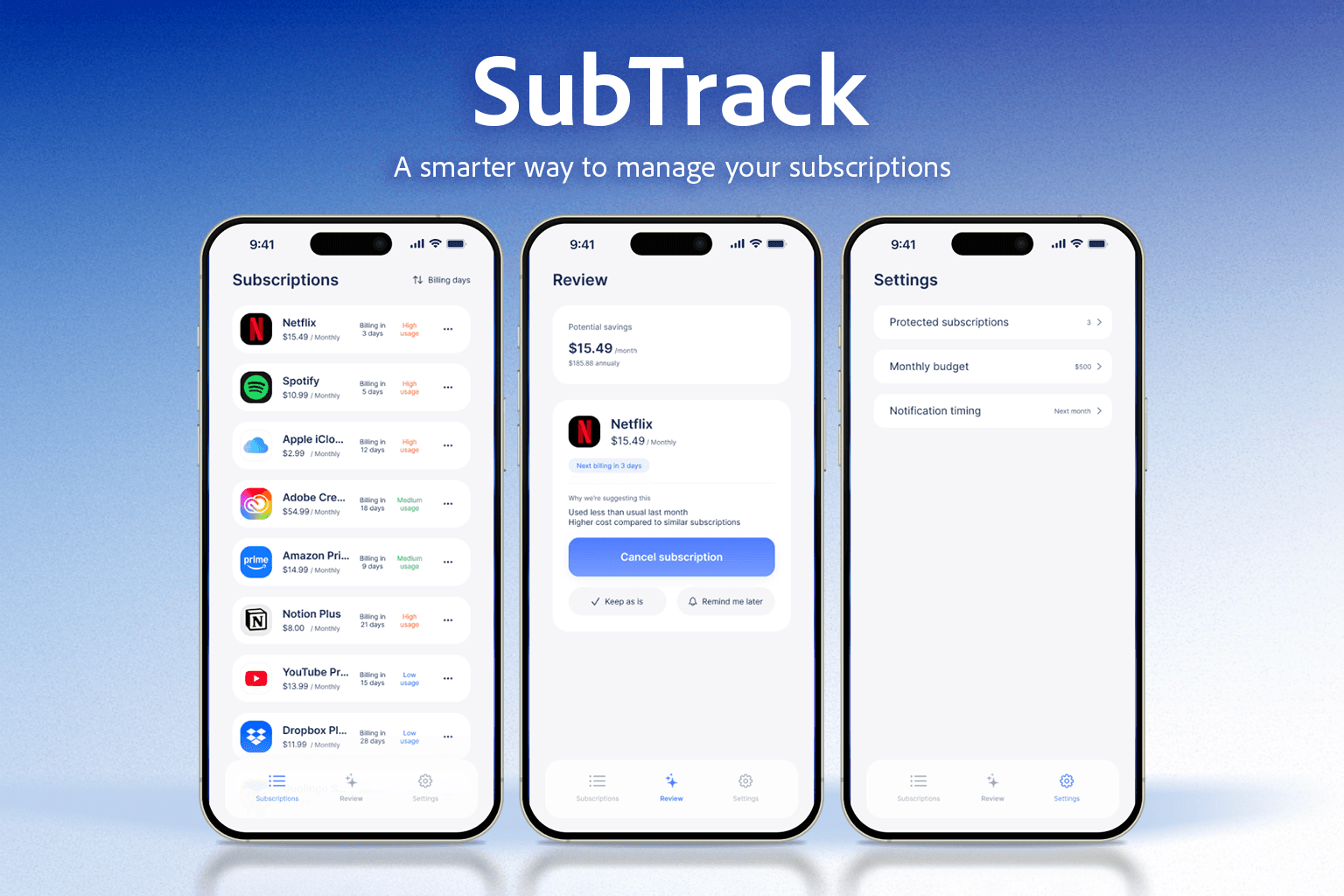
The solution was implemented as a simple three-screen structure, each screen serving a distinct role in the decision-making process.
The Review screen acts as the core of the experience. It presents a single subscription recommendation, along with clear context on potential savings and the reason for the suggestion. By limiting the focus to one item at a time, the interface encourages thoughtful action without overwhelming the user.
The Subscriptions screen provides an overview of all active subscriptions, but is intentionally designed as a secondary space. It allows users to explore and understand their subscriptions when they choose to, without competing with the primary review flow.
The Settings screen defines personal boundaries rather than controls. Instead of enforcing strict rules, it allows users to indicate protected subscriptions, budget guidelines, and notification timing, reinforcing the idea that SubTrack supports decisions rather than dictates them.
Implementation decisions were made with technical feasibility in mind. Since subscriptions cannot be cancelled directly within the app, the “Cancel subscription” action guides users through a confirmation step and then redirects them to the service’s official cancellation page. This behavior is intentionally designed to reflect real-world constraints, and the full flow is included and viewable in the prototype.
Data assumptions also informed the design. Billing dates are assumed to be retrieved from connected payment providers, while usage signals are derived from system-level screen time data. Recommendation logic is based on a combination of low usage, high cost, and upcoming billing timing, allowing the interface to surface subscriptions that are most relevant to review at that moment.
Across all screens, the UI tone was kept calm, quiet, and confident. Visual elements were minimized, actions were clearly prioritized, and consistency was favored over novelty to ensure that the interface feels trustworthy and grounded in practical implementation.
Results
As a result of this project, I arrived at a UI concept that prioritizes decision clarity over feature richness.
By limiting the experience to one recommendation at a time and reducing available actions, the interface successfully reframes subscription review as a manageable, low-pressure task rather than an ongoing obligation. The design demonstrates how reducing choice and visual noise can increase confidence and follow-through in personal finance decisions.
This project reinforced the importance of designing not just for usability, but for emotional and cognitive load. It also highlighted how acknowledging technical and real-world constraints early can lead to more honest and implementable UX solutions.
If this concept were to be developed further, the next steps would include validating recommendation timing, testing user confidence before and after decisions, and refining notification strategies to better align with individual financial habits.